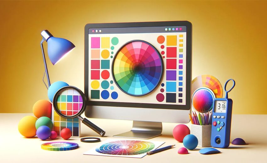
How Color Choices Can Make or Break Your Website!
1. Introduction
The power of color in web design cannot be overstated. Every color conveys a message, setting the tone and mood of your website. This blog explores how your choice of colors can influence visitors, enhance brand recognition, and make your site visually appealing and effective.
2. The Psychology of Colors in Web Design
Color psychology reveals how different hues impact emotions and behaviors. Warm colors like red and yellow can evoke energy and excitement, while cool colors like blue and green offer calmness and trust. Understanding these subtle influences can help in creating a website that resonates with your target audience.
3. How Color Choices Influence User Experience
Colors are integral to user experience (UX) by guiding visitors’ eyes and evoking feelings. High contrast can improve readability, while harmonious colors make navigation more pleasant. A well-planned color scheme also emphasizes elements like call-to-action buttons, leading to more engagement.
4. Brand Identity and Color Consistency
Consistent color schemes create a memorable brand identity. For example, companies like Facebook, Coca-Cola, and McDonald’s use specific colors to strengthen brand recognition. When visitors repeatedly see these colors, they instantly associate them with the brand, fostering familiarity and loyalty.
5. Tips for Choosing the Right Color Palette
Choosing the right colors involves balancing aesthetics, brand identity, and functionality. Tips include:
- Identify Brand Values: Colors should reflect your brand’s personality.
- Use a Limited Palette: Three or four colors are often enough.
- Consider Your Audience: Colors appeal differently across demographics.
- Think About Contrast: Ensure text and background contrast for readability.
6. Accessibility Considerations in Color Choices
Website accessibility means making your content usable for everyone, including those with visual impairments. Using high-contrast color combinations, avoiding color-reliant information, and enabling dark modes are practical ways to achieve this.
7. Real-Life Examples of Effective Color Use in Websites
Several websites exemplify excellent color usage:
- Dropbox: Uses clean, modern colors to create a professional and inviting look.
- Spotify: Green and black convey energy and sophistication, ideal for a music streaming service.
- Asana: Light, pastel colors foster a sense of calm and focus, matching the productivity software’s aim.
8. How GET SERVICES Can Help You Design a Colorful, Impactful Website
When it comes to creating visually appealing websites that make an impact, GET SERVICES is here to help. With expertise in color psychology and UI/UX design, GET SERVICES ensures your website’s color scheme enhances user engagement, brand recognition, and overall appeal. Learn more about our services at GET SERVICES.
9. Conclusion
Color choice is more than just aesthetics; it’s a key part of a website’s overall effectiveness. From influencing emotions to enhancing readability, the right colors can create a lasting impression. Ready to transform your website’s color palette? Start today with professional design guidance from GET SERVICES.

10 Stunning Examples of Websites That Got Their...


